
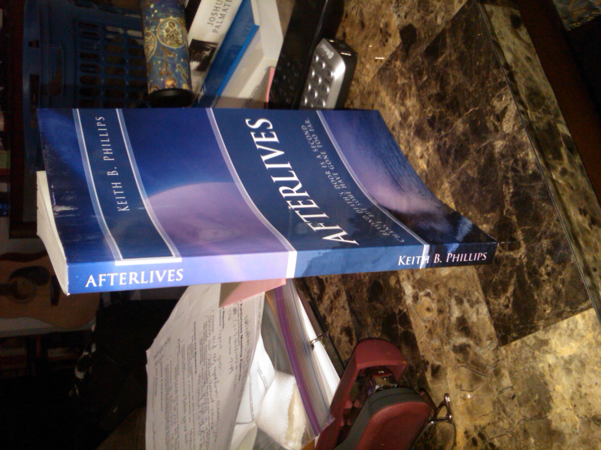
 The proof has arrived, and boy am I screwed. The 6×9 format that I chose looks silly on this small book. So I need to change it to the 5×8 format. A friend of mine suggested I go with the Format A paperback size. That would be 4.33 x 7.01. Createspace says that you have to use one of their standard industry sizes to take advantage of their Expanded Distribution Channel. So the smallest that I can make it is either 5×8 or 5.06 x 7.81. Since I want to use cream color paper, I must use the 5×8 format. So I have decided on that one.
Other problem I’ve noticed so far: Gutters are too large. This is a tricky setting, based on the number of pages in your book. The gutter is the white space in the center of the book, which allows for the binding. And from what I’ve seen, for my paltry 175 page book, a gutter size of .75 was overkill. So I’ve cut that back to .5 and hopefully that will do the job. Otherwise, I will have some more fun when the next proof comes.
Changing to format 5×8 makes the font size look too large, so I’ve cut that back from 12 pt to 10pt.
Next: This amateur typesetter did not think about hyphens and full justification. The text does not look book-like. It has a ragged right edge, which somehow did not alarm me when looking at the PDF, but when looking at the actual book, sticks out like a sore thumb. I have corrected these items, and that has reduced my number of pages to 170.
One other thing. My indents were too deep by about .1 inch. I’ve reduced them from .3 to .2.
And finally, I’ve found several echo words on the printed page which I never saw on the screen. Words repeated too closely together in the text that make it sound ridiculous. So I will be hunting and killing those.
All in all, a valuable experience, and one that I will certainly make good use of.
You must be logged in to post a comment.